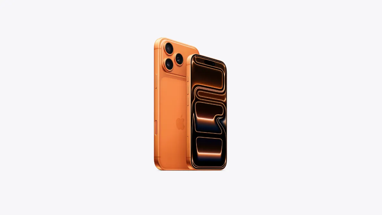
Why the Apple Logo Is a Half-Bitten Apple
The Apple logo is one of the most recognized symbols in the world today. From iPhones to MacBooks, it appears everywhere and is instantly associated with innovation, quality, and design excellence. But have you ever wondered why the Apple logo is a half-bitten apple instead of a whole one? This question has fascinated tech enthusiasts, branding experts, and everyday users alike for decades. Let’s dive deep into the story behind this iconic symbol.
The Origin of the Apple Logo
When Apple was founded in 1976 by Steve Jobs, Steve Wozniak, and Ronald Wayne, the first logo was far from what we see today. The original Apple logo, designed by Wayne, showed Isaac Newton sitting under an apple tree, inspired by the fruit that supposedly led to his theory of gravity.
However, this design was too complex and old-fashioned for a company that aimed to be modern and forward-thinking. Steve Jobs quickly realized the need for a simple and memorable symbol that could be easily recognized worldwide. This led to the creation of the Apple logo as we know it today.
Why a Half-Bitten Apple Instead of a Whole One?
The most common question people ask is: why is there a bite in the Apple logo? Wouldn’t a full apple look better? The answer lies in both practicality and symbolism.
To Avoid Confusion with a Cherry or Tomato
When designer Rob Janoff created the Apple logo in 1977, he made a simple apple shape. But a solid apple silhouette could easily be mistaken for other round fruits like a cherry or tomato. Adding a “bite” instantly clarified that it was an apple. This small detail ensured global recognition.
The “Byte” Pun in Technology
Some believe the bite represents a play on words. In computing, a “byte” is a unit of digital data. Apple was emerging as a major technology company in the late 1970s, so this clever pun connected the logo with the digital world. While Janoff has downplayed this theory, the connection is too perfect to ignore, and it has become part of Apple’s cultural story.
Human Connection and Accessibility
Another symbolic interpretation is that the bite makes the apple relatable. A whole fruit can seem distant, but a bitten apple suggests interaction. It feels human, approachable, and inviting—qualities Apple has always emphasized in its products.
The Evolution of the Apple Logo
The Apple logo has gone through several transformations, but the half-bite has always remained.
The Rainbow Apple (1977–1998)
Apple’s first modern logo featured rainbow stripes inside the bitten apple. This colorful design highlighted Apple’s focus on creativity and innovation. It also aligned with the launch of the Apple II, one of the first computers to display color graphics.
The Monochrome Era (1998–2000s)
When Steve Jobs returned to Apple in 1997, he pushed for a cleaner, sleeker identity. The rainbow logo was replaced with a monochrome version that better matched the modern design of products like the iMac.
The Glossy and Flat Versions (2000s–Present)
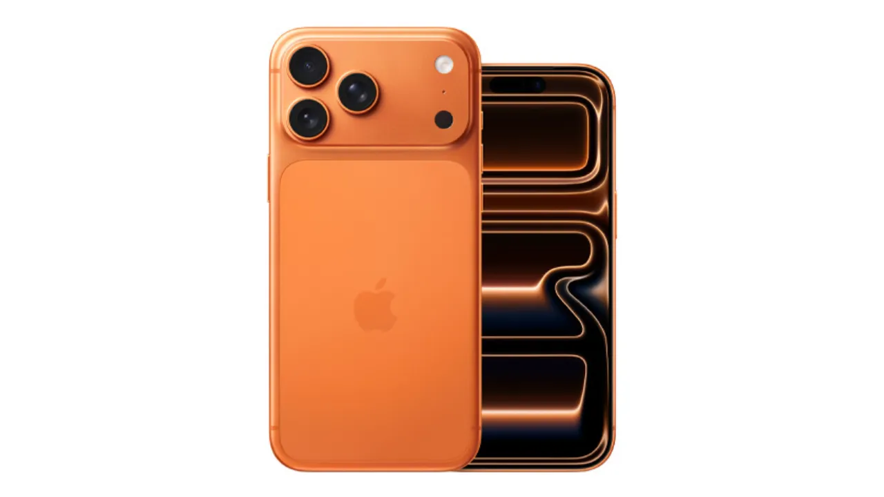
In the early 2000s, Apple experimented with glossy, 3D-like versions of the logo to reflect its futuristic image. But as design trends shifted to minimalism, Apple adopted a flat, simple version of the bitten apple. Today, it appears in white, silver, or black depending on the product.
Symbolism of the Apple Logo
Beyond design choices, the Apple logo carries deeper meaning that resonates with people worldwide.
Knowledge and the Apple from the Tree of Wisdom
In many cultures, the apple is a symbol of knowledge and discovery. From the biblical story of Adam and Eve to Newton’s discovery of gravity, the apple represents enlightenment. Apple Inc. positioned itself as a company that gives people tools to learn, create, and explore—making the fruit a fitting emblem.
Simplicity as Core Philosophy
Apple has always focused on simplicity, both in its products and branding. A half-bitten apple is simple, elegant, and instantly recognizable. It mirrors the philosophy behind Apple’s user-friendly devices.
The Myths Surrounding the Apple Logo
Over the years, several myths have grown around the Apple logo, adding to its mystery.
Tribute to Alan Turing
One widely circulated myth suggests the logo honors Alan Turing, the British mathematician considered the father of modern computing. Turing died after consuming a cyanide-laced apple, and some speculate that Apple’s bitten fruit was a tribute to him. However, designer Rob Janoff has clarified that this was never the intention.
Hidden Religious or Cultural Meanings
Others have connected the bitten apple to religious stories like Adam and Eve. While this adds symbolic weight, Apple has never officially confirmed such associations. The simplicity of design and practicality were the true driving forces.
Why the Apple Logo Works So Well
The success of the Apple logo is no accident. It embodies several principles of great branding.
Simplicity and Memorability
Logos work best when they are simple and instantly recognizable. The Apple logo achieves this with a clean, universal shape.
Versatility Across Products
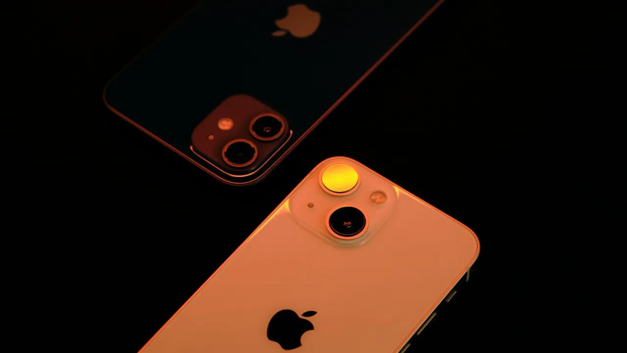
From a tiny icon on an iPhone screen to a glowing emblem on a MacBook lid, the logo scales perfectly across different formats.
Emotional Connection
The bite adds a human touch, making the logo feel less like a corporate symbol and more like a friendly companion. Combined with Apple’s focus on design and innovation, it creates emotional loyalty among users.
Apple’s Logo in Modern Culture
Today, the Apple logo is not just a company symbol—it’s a cultural icon. It represents creativity, innovation, and status. People proudly display it on their devices, and the brand identity has become as valuable as the products themselves.
Apple’s logo is now one of the most valuable trademarks in the world. According to industry reports, the Apple brand alone is worth hundreds of billions of dollars, largely due to its iconic and trusted logo.
Conclusion
The Apple logo, a half-bitten apple, is more than just a clever design choice. It avoids confusion with other fruits, plays on the word “byte,” symbolizes knowledge, and connects emotionally with people. Over the years, it has evolved in style but never lost its essential character.
What started as a simple design in 1977 has grown into one of the most recognized and powerful symbols in the world. The half-bite remains a reminder that great branding comes from simplicity, relatability, and meaning. Just like Apple’s products, the logo proves that less can indeed be more.


